How To Design A Restaurant
1. Create The Concept
All great restaurants start with a strong concept. Whether it’s a simple hamburger joint or a fine dining experience with Michelin star aspirations the best restaurants start with a well thought through menu offer that is served in a considered space that compliments the food. It doesn’t have to be complicated, so long as it implemented with sincerity & authenticity.
Bill’s restaurants started life as a humble fruit & veg shop in small Sussex town, which soon developed into a café, then became a successful national chain.
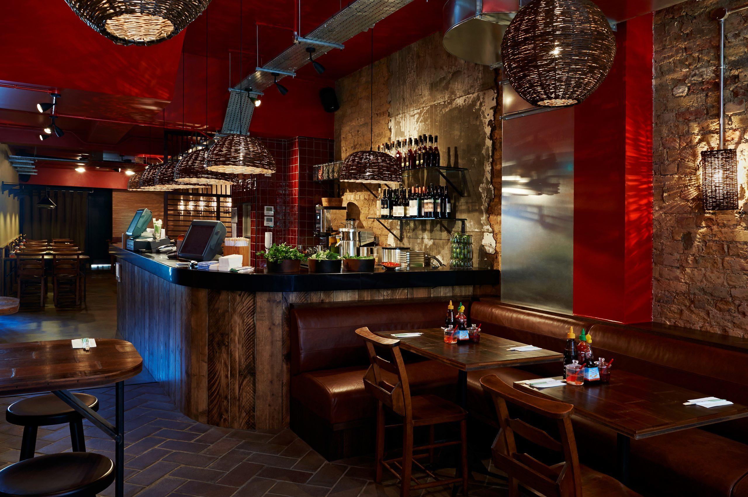
One of our clients, Pho Vietnamese Street Food, had a simple mission statement: to bring fresh Vietnamese casual dining to a UK market, but giving it contemporary European twist, which we were very proud to help them realise and create a strong brand identity to over thirty restaurants from Chiswick to Cardiff to Exeter.

Pho Chiswick, London
The Ivy restaurant is one of the country’s oldest restaurants, which became a glamorous celebrity haunt, then a private members club, which has now been transformed into a chain of brasseries, while maintaining the same basic DNA as the original restaurant.
2. Plan The Space
Form follows function. For a successful restaurant to work it must flow operationally and ergonomically. The back-bone of the restaurant, the kitchen, has to be the correct size, layout & in the right location, as does all the important back of house services.From when the customer enters the restaurant they have the be almost only subliminally aware that the host greets them at just the right moment they enter the premises: that if there is a coat check their coat is taken at just the right time and they are ushered through, perhaps to the bar for a cocktail before dinner, then transitioned seamlessly through to the main restaurant.I always find the Delaunay in London is the perfect example of well-planned restaurant with great attention to the customer journey.
3. Apply The Concept to the space
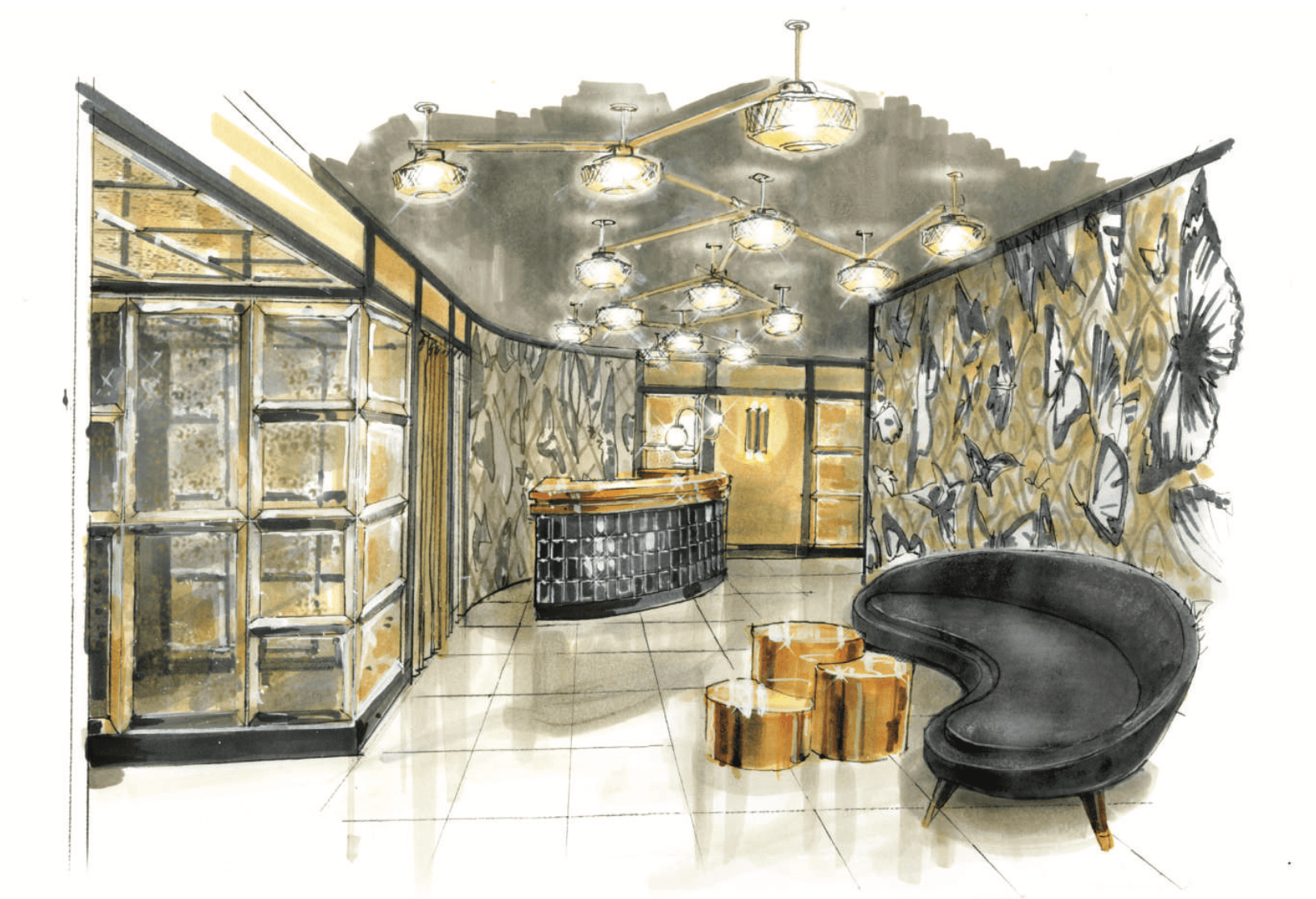
The next exciting stage is to apply the restaurant concept to the agreed plan layout. This is the fun bit! Using our concept inspiration boards & samples- we always start with loose freehand sketches, then work up elevations, adding layers of colours, finishes, fabrics & furnishings – breathing life into the into specially commissioned artists impressions

Of course, throughout this stage we’ll be meeting regularly with the client as the concept takes shape so we can all experience the journey and input as necessary.
Other consultants will also be on board at this stage, from project manager or cost consultant to kitchen designer to brand manager and audio-visual consultant – all contributing their own unique skills & applying their special knowledge of their chosen fields.
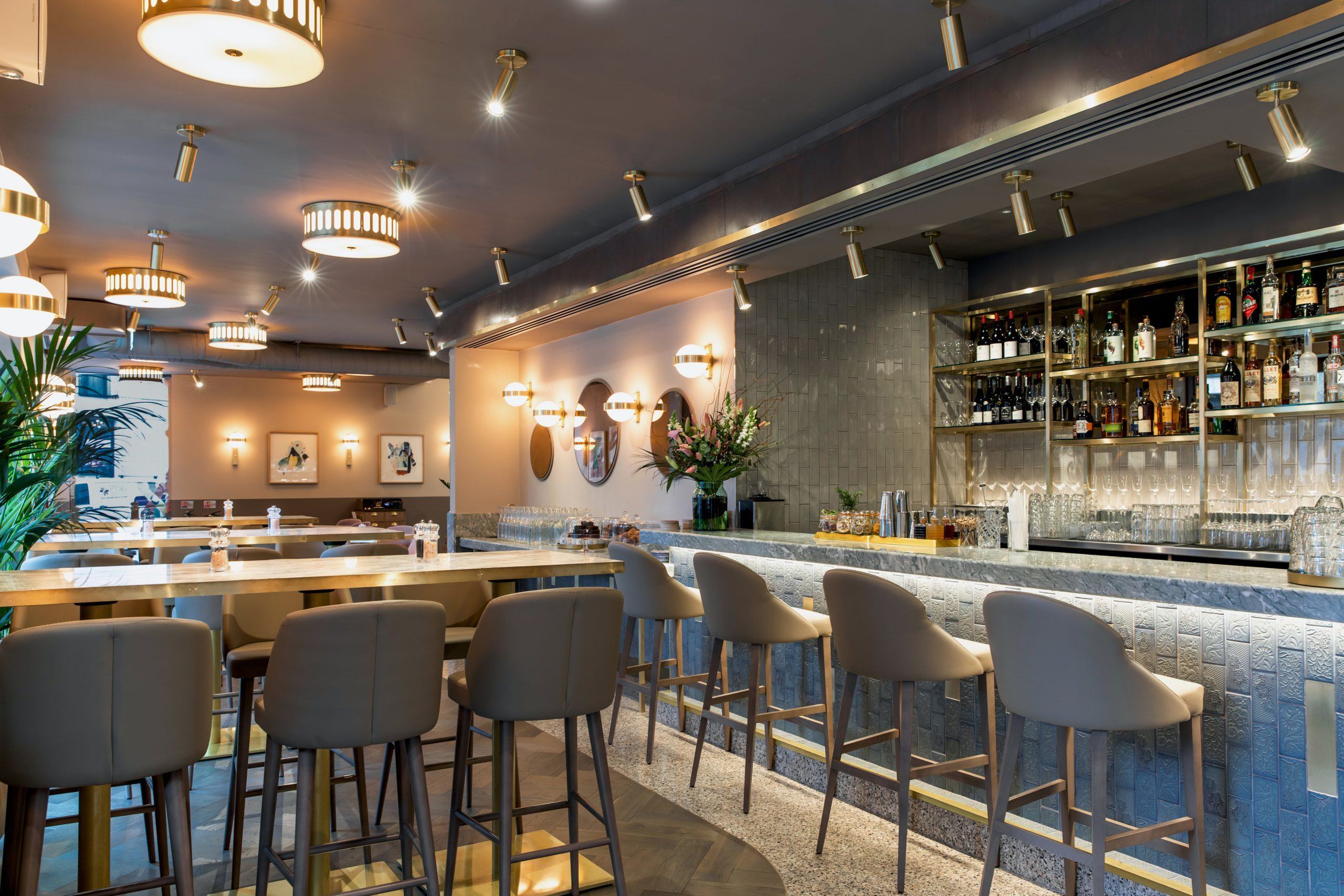
Our recent design for the new Wulf & Lamb restaurant in Marylebone is a goodexample of how a concept is applied to a simple, well considered plan layout –and was a great project to work on too.

Wulf and Lamb, London
4. ‘God Is In the detail’
Mies van der Rohe’s often quote line is as true now as it ever was (let’s ignore the fact that he may not have actually said it for now).
We have our beautifully designed restaurant, in the perfect location of course, which works operationally, ergonomically & has a fantastic menu.
Now we have to get down to design detailing. The seats & banquettes must the just the correct height (& they must both be the same height – have you ever been in a restaurant where you are sat lower than your dining companion opposite?!). The lighting has to have the correct level of intimacy yet clear enough for your to be able to read the menu without your smartphone.
The waiter stations should be beautifully discreet yet be designed perfectly to house all the equipment such as tills, fridges or cash drawers – with no unsightly wires or chargers dangling in customer view.
Same go for the bar, which should be in perfect proportion to the bar stools as well as accommodate equipment & glassware while still displaying bottles & drinks in a captivating way – or maybe the bottle display needs to be hiddenduring the day, with a cleverly designed screen, which is always tricky to get just right.
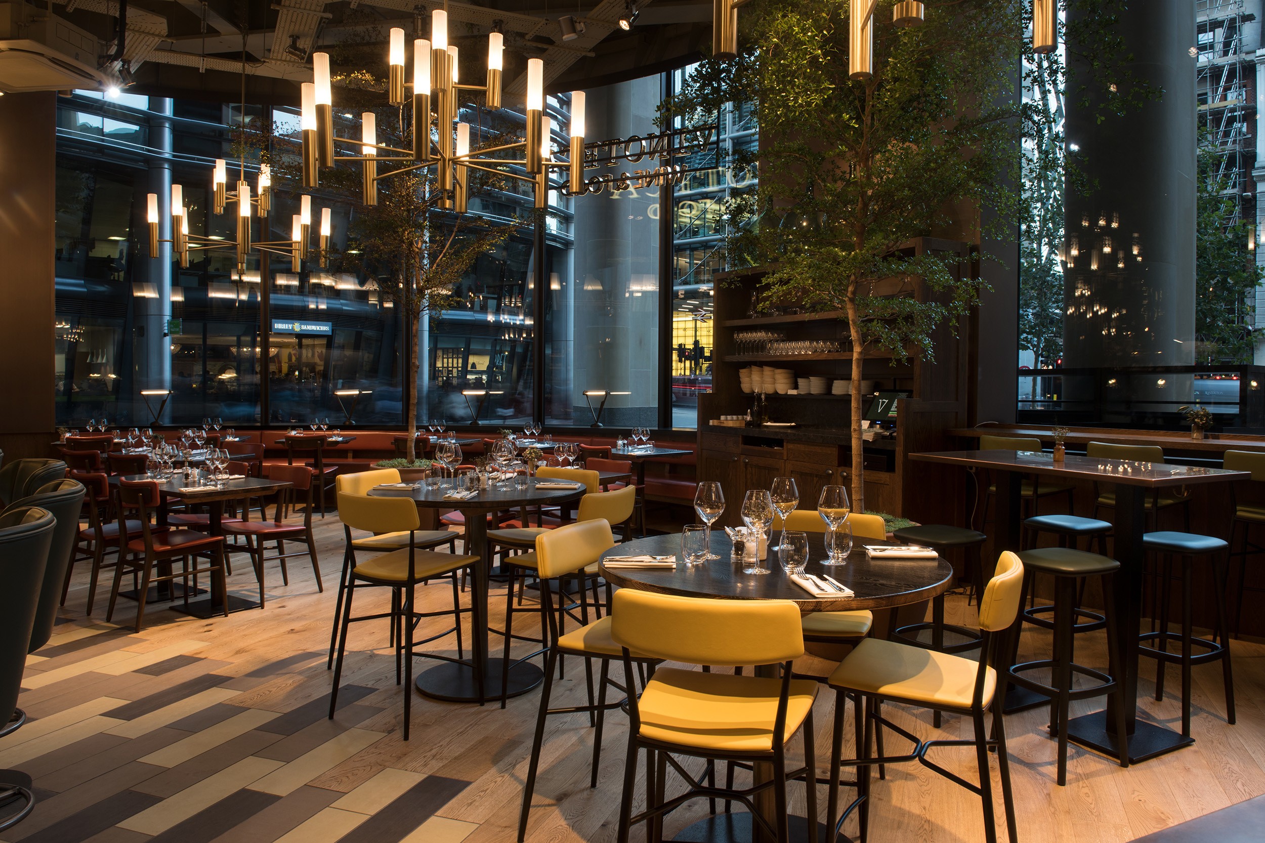
Our design for the bar at Vinoteca City has been very well received, as it has a café feel during the day, transitioning to a relaxed after work bar early evening & then again to a cocktail bar as the evening progresses. This is all down to the shape & location of the bar, what it looks like of course, as well as the layout and heights of the furniture. The lighting to is vital, as the vast glass shopfront lets in light during the day but needs to feel warm at night.

The Bar at Vinoteca City, London
5. Finishing Touches
The finishing touches often create the impression the customer keeps as they remember their dining experience. The all-important food & service are the key ingredients of course, followed by overall design ambience – and lets not forget the trip to the washrooms, which is increasingly important in this Instagram age.
It’s important that we don’t forget a host of other incidentals that contribute to the design, such as table decorations, candle illumination, staff uniforms, floral arrangements, exterior planting… the list goes on.
By now though you should have a pretty good idea of a few key ingredients that make up a well-designed restaurant, though if you need any more help I’d be happy to take your call!
